Visuellen Universum
Typografien
Typografien
Print-Typografien
VERLAG
![](https://lmih.lu/wp-content/uploads/VERLAG.png)
FIR DEN TITEL AN TEXTKIERPER
Huelt am léifsten d’Schrëft Verlag.
Black
![](https://lmih.lu/wp-content/uploads/NB_SIGNATURE_TYPOGRAPHIE-VERLAG_01.jpg)
![](https://lmih.lu/wp-content/uploads/verlag-black.png)
ANER ART VUN ZEECHEN
Bold
![](https://lmih.lu/wp-content/uploads/NB_SIGNATURE_TYPOGRAPHIE-VERLAG_02.jpg)
![](https://lmih.lu/wp-content/uploads/verlag-bold.png)
Book
![](https://lmih.lu/wp-content/uploads/NB_SIGNATURE_TYPOGRAPHIE-VERLAG_03.jpg)
![](https://lmih.lu/wp-content/uploads/verlag-book.png)
Light
![](https://lmih.lu/wp-content/uploads/NB_SIGNATURE_TYPOGRAPHIE-VERLAG_04.jpg)
![](https://lmih.lu/wp-content/uploads/verlag-light.png)
Extra Light
![](https://lmih.lu/wp-content/uploads/NB_SIGNATURE_TYPOGRAPHIE-VERLAG_05.jpg)
![](https://lmih.lu/wp-content/uploads/verlag-extralight.png)
GOTHAM
![](https://lmih.lu/wp-content/uploads/GOTHAM.png)
FIR DEN TEXTKIERPER
Et ass och méiglech, d’Gotham Typografie ze huelen.
Black
![](https://lmih.lu/wp-content/uploads/NB_SIGNATURE_TYPOGRAPHIE-GOTHAM_01.jpg)
![](https://lmih.lu/wp-content/uploads/gotham-black.png)
Bold
![](https://lmih.lu/wp-content/uploads/NB_SIGNATURE_TYPOGRAPHIE-GOTHAM_02.jpg)
![](https://lmih.lu/wp-content/uploads/gotham-bold.png)
Book
![](https://lmih.lu/wp-content/uploads/NB_SIGNATURE_TYPOGRAPHIE-GOTHAM_03.jpg)
![](https://lmih.lu/wp-content/uploads/gotham-book.png)
CHRONICLE
![](https://lmih.lu/wp-content/uploads/CHRONICLE.png)
FIR DEN TEXTKIERPER
Als Serif-Schrëft ass et och méiglech, Chronicle amplaz vu Verlag ze huelen.
Bold
![](https://lmih.lu/wp-content/uploads/NB_SIGNATURE_TYPOGRAPHIE-CHRONICLE_01.jpg)
![](https://lmih.lu/wp-content/uploads/chronicle-bold.png)
Bold italic
![](https://lmih.lu/wp-content/uploads/NB_SIGNATURE_TYPOGRAPHIE-CHRONICLE_02.jpg)
![](https://lmih.lu/wp-content/uploads/chronicle-bolditalic.png)
Semibold
![](https://lmih.lu/wp-content/uploads/NB_SIGNATURE_TYPOGRAPHIE-CHRONICLE_03.jpg)
![](https://lmih.lu/wp-content/uploads/chronicle-semibold.png)
Semibold italic
![](https://lmih.lu/wp-content/uploads/NB_SIGNATURE_TYPOGRAPHIE-CHRONICLE_04.jpg)
![](https://lmih.lu/wp-content/uploads/chronicle-semibolditalic.png)
Roman
![](https://lmih.lu/wp-content/uploads/NB_SIGNATURE_TYPOGRAPHIE-CHRONICLE_05-1.jpg)
![](https://lmih.lu/wp-content/uploads/chronicle-roman.png)
Italic
![](https://lmih.lu/wp-content/uploads/NB_SIGNATURE_TYPOGRAPHIE-CHRONICLE_06-1.jpg)
![](https://lmih.lu/wp-content/uploads/chronicle-italic.png)
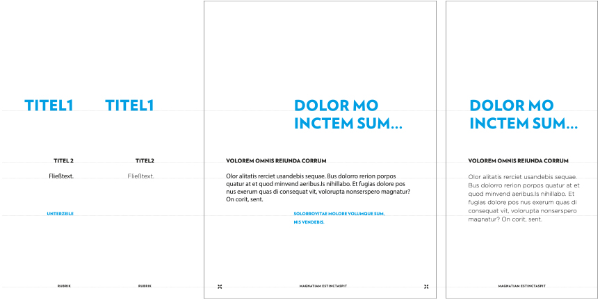
Beispiller vun Interaktioun vu Schrëften
Déi verschidde Schrëften a Schreifstiler musse geholl gi fir den Inhalt besser ze strukturéieren.
D’Prioritéit vun de Schrëften erméiglecht eng optimal Liesbarkeet, déi un all Format ugepasst ka ginn.
![](https://lmih.lu/wp-content/uploads/NB_SIGNATURE_TYPOGRAPHIE-Exemple_01.jpg)
Web-Typografien
BRANDONGROTESQUE
![](https://lmih.lu/wp-content/uploads/BRANDONGROTESQUE.png)
Webschrëft fir d’Iwwerschrëften
D’Schrëft Brandon Grotesque muss fir d’Iwwerschrëften um Web geholl ginn.
Black
![](https://lmih.lu/wp-content/uploads/NB_SIGNATURE_TYPOGRAPHIE-BRANDON_01.jpg)
![](https://lmih.lu/wp-content/uploads/brandongrotesque-black.png)
Bold
![](https://lmih.lu/wp-content/uploads/NB_SIGNATURE_TYPOGRAPHIE-BRANDON_02.jpg)
![](https://lmih.lu/wp-content/uploads/brandongrotesque-bold.png)
Medium
![](https://lmih.lu/wp-content/uploads/NB_SIGNATURE_TYPOGRAPHIE-BRANDON_03.jpg)
![](https://lmih.lu/wp-content/uploads/brandongrotesque-medium.png)
Regular
![](https://lmih.lu/wp-content/uploads/NB_SIGNATURE_TYPOGRAPHIE-BRANDON_04.jpg)
![](https://lmih.lu/wp-content/uploads/brandongrotesque-regular.png)
Italic
![](https://lmih.lu/wp-content/uploads/NB_SIGNATURE_TYPOGRAPHIE-BRANDON_05.jpg)
![](https://lmih.lu/wp-content/uploads/brandongrotesque-italic.png)
Light
![](https://lmih.lu/wp-content/uploads/NB_SIGNATURE_TYPOGRAPHIE-BRANDON_06.jpg)
![](https://lmih.lu/wp-content/uploads/brandongrotesque-light.png)
CALIBRI
![](https://lmih.lu/wp-content/uploads/CALIBRI.png)
Web-Typografie fir den Textkierper
D’Calibri-Typografie ass d’Typografie, déi fir Textkierper um Internet muss geholl ginn.
Bold
![](https://lmih.lu/wp-content/uploads/NB_SIGNATURE_TYPOGRAPHIE-CALIBRI_01.png)
![](https://lmih.lu/wp-content/uploads/calibri-bold.png)
Regular
![](https://lmih.lu/wp-content/uploads/NB_SIGNATURE_TYPOGRAPHIE-CALIBRI_02.png)
![](https://lmih.lu/wp-content/uploads/calibri-regular.png)